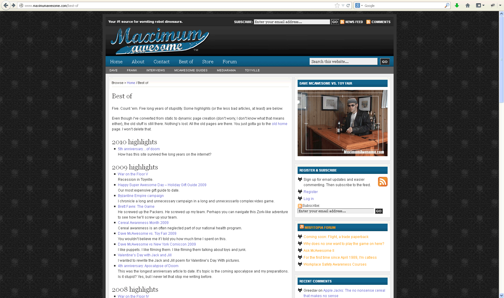
Just when I promised myself no more drastic changes, I made more drastic changes. I moved the whole site to a CMS for easier maintenance. I keep trying to tell myself that while updating hundreds of static pages to fit in better with the rest of the site. Rock on.
Yeah, okay, so after four years, I got sick of hand coding the site. What did I do? I threw out all my time-honored cool-but-sucky design aesthetics for some basic, cookie-cutter web jambaloo.
I don’t have much to say about this design. On the one hand, it did a lot of things that took me aeons to do from scratch. On the other, I dunno, it was just kinda there. It lost all the homemade, disheveled character from the hand-coded site. For the sake of Frank’s sanity, I swapped my beloved off-white text on black background for standard black text on white. Sheesh. Every time I looked at it, I thought, “how can I get this back to white on black?”
As CMSes became more powerful and flexible, I started designing/skinning sites for friends. I generally did a better job for them than for my own stuff. Quickly, I got burned out trying to redesign this site, so Mk. 5 remained years past its usefulness.


[…] Move on to Mk. 5. […]